
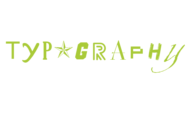
 Everyone knows that the images you use in a scribe will impact the message. Obvious, right? But if you underestimate the power of the fonts you risk underselling your message. Fonts are just as important – here's why.
This is the fifth article in a series that teaches you how to make powerful and unforgettable scribe videos. See the end of the post for more.
A good scriber knows that a well-chosen typeface looks stylish and doesn't distract from the message of the scribe. An expert scriber knows that choosing the perfect typeface can strengthen that message and bring all the other visual elements together. Knowing the distinction will make all the difference.
Minimal is best
First things first– just like colour it is best to keep the number of different typefaces in your video or scribe to a minimum. We recommend using no more than two typefaces at all.
Second – when you can avoid type, avoid it.

Type is there to help communicate and is often essential to tell viewers information– but less text and more images works a lot better. Viewers expect to watch a video, not read it.
If you are using a voiceover in your scribes then it is very rare that you will need any text. The only exception might be having a URL or contact information 'written' on-screen. Images help people to retain information better than just text, as they are normally easier to recall. Only scribe the most important, unavoidable bits of text.
Who's the boss? Hierarchy
Creating hierarchy in typography is important for communicating your message effectively. Your viewers will only have so much patience for taking in the information on-screen, so you want to make sure your viewers see the most important things first.
Size is the most obvious way to create hierarchy in your typography. Increasing the point size is going to draw the viewers' eyes to those bigger things first:

Weight works similarly to size. Bold or italic text will be more prominent in the hierarchy as the eye is drawn to what is different. Bold text naturally commands more attention because it takes up more space than regular text.

Using a different colour for a portion of your text can help things stand out as well. It is also worth looking at the post about colour to see what colour combinations will have the most power.

The position of your text will determine what people read first. Will your readers read from left to right or right to left? This can determine which areas readers are most likely to look at first.
Avoid putting the most important parts of your text at the bottom of the page. This is normally where the small print is – the parts that nobody really reads!
 Giving space to your important text is crucial. If you pack an important bit right into the middle of a block of unimportant bits, people are going to struggle to find it quickly.
Give that bit of text your want people lots of space and it is instantly a lot easier to find.

Typefaces and tone

Typefaces can convey a whole range of messages and feelings, so take care when choosing yours.
Chunky, blocky typefaces are loud and powerful. People will tend to read them in a shouting voice. They grab attention and are used a lot for product adverts. Script typefaces convey elegance and lightness, and are generally used to give a feeling of quality and class, love and beauty.
Typefaces with smoother edges and rounded corners are more fun and joyful, compared to serious (mainly serif) typefaces that have a lot of regular, straight lines. Hand-drawn typefaces communicate a wholesome and organic feeling, and are likely to be interpreted as friendly.
Size and spacing
This is very important to consider in your scribes, depending on how much power you want text to have overall. If your scribe needs to be text-heavy, you will need make the text itself look great on its own.
The spacing you choose for your text can also convey certain impressions– text where the letters and lines are tightly spaced are ideal for friendlier, chattier purposes. Text with lots of spacing gives a feeling of simplicity and will give your scribe an air of elegance and class.
Some things to think about when formatting:
Point size
The actual size of the typeface.

Leading (line height)
The space between each line of text.

Kerning (character spacing)
The space between each letter can make text look very cramped and busy, or more spaced out and elegant.

Line length
Make sure your lines of text aren't so short that there are only a few words on each line, but not so long that readers will lose their place when they go from one line to the next. You don't want more than six or seven words on a line.

Useful typography tools
There are thousands of typefaces that draw well in VideoScribe. A few sites with free fonts to get you started:
More expert advice from the Better Scribes series:
The Better Scribes series includes:
- How to give your scribe a heart
- Captivate your audience with these pro colour tips
- How to record a professional sounding voiceover
- The layout lowdown from a design expert
- Why forgetting fonts is a big mistake
- 4 Easy ways to find original images for VideoScribe
- Are you guilty of these amateur timing mistakes?
- The secrets to ridiculously persuasive scribing
- How to hit the right note with scribe music
- 7 Clever tricks seasoned scribers swear by
.png "VideoScribe")


COMMENTS